What shop design can look like: Sneakstar in Flensburg
Industrial look mixed with elements hinting of history
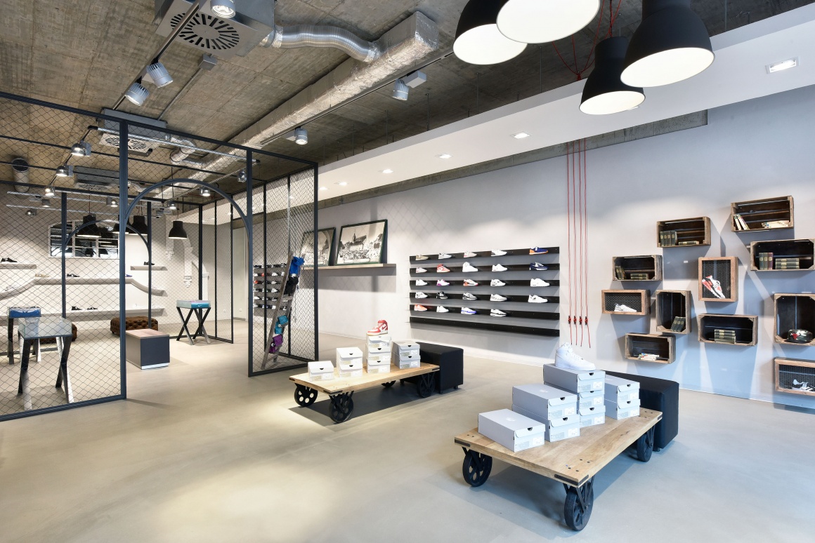
There it is again, the mix between genuine brick, simple wood furniture and an industrial look that is currently reflected in many store concepts.
... more store examples
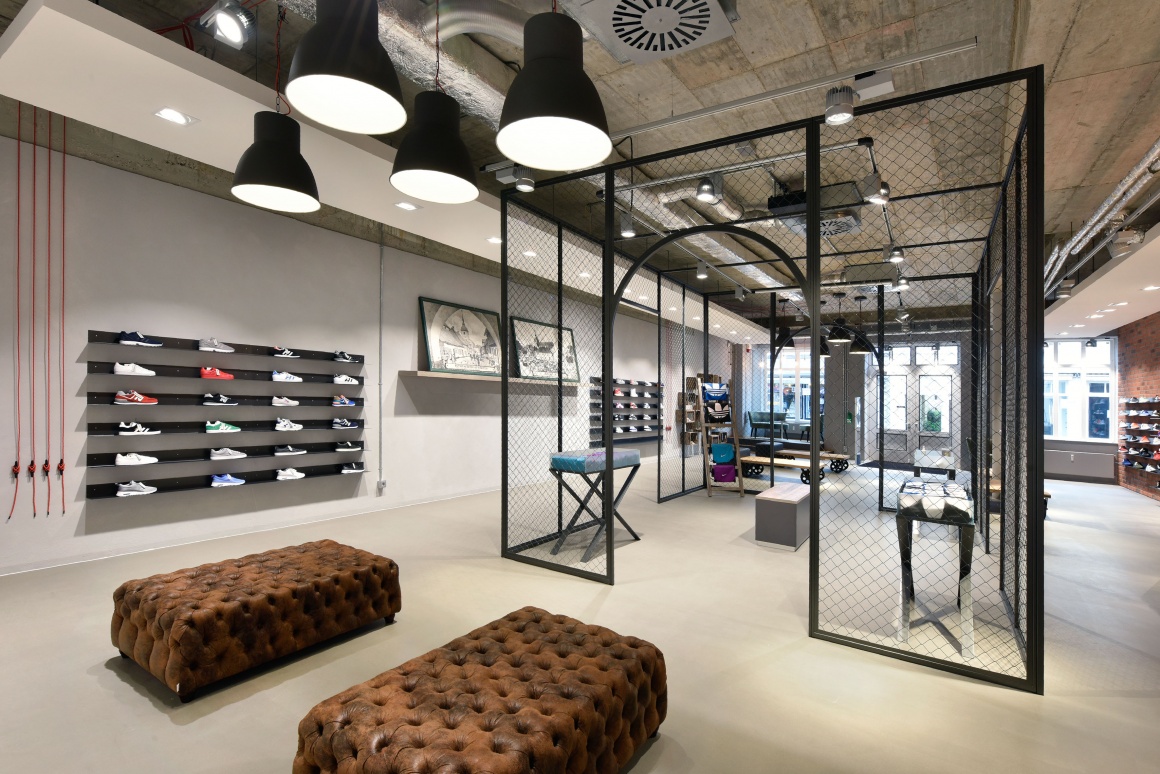
On the sales floor, the wooden platforms on wheels are surprising eye-catchers. The shoes can be tried out on rustic, seemingly old leather benches in the back part of the room.
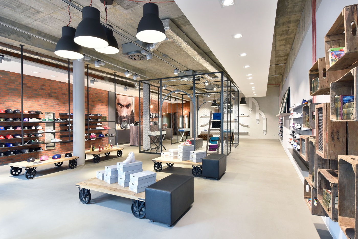
The products are very generously displayed. Individual shoes are showcased in different ways: on ladder-like structures, glass tables on metal frames and metal brackets in the brickwork. A cage structure made of meshed metal creates an open cube with four entrances. The checkout system next to it is hidden behind wood planks – and right above it is a large photo featuring the portrait of a man.
The wooden crates that are attached to the wall contain smaller articles and decorative elements like antique books. The rear panel has a concrete design.
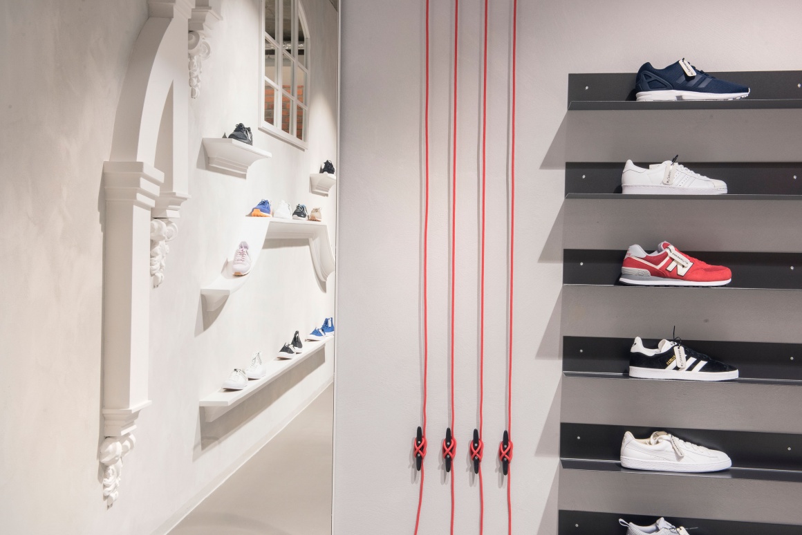
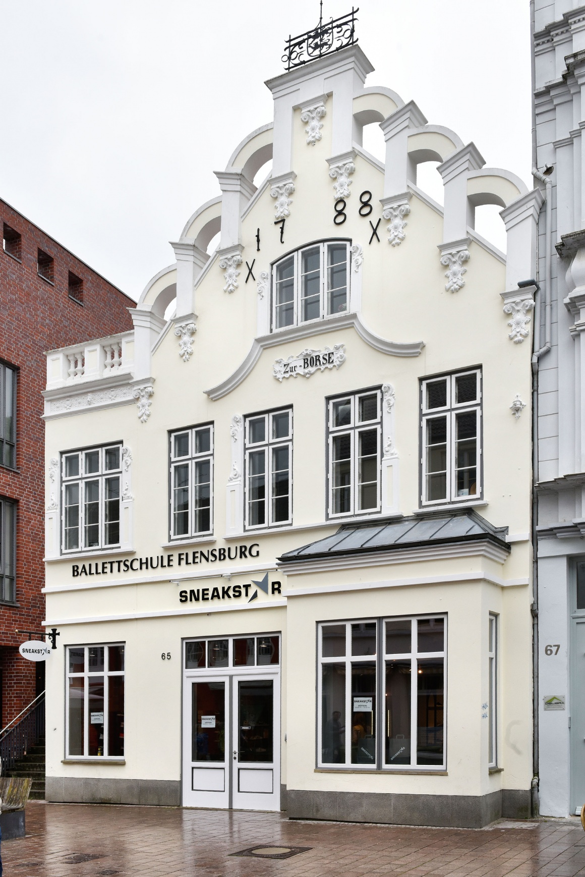
Stucco elements in the back part of the store catch your eye. On the one hand, they are in stark contrast to the modern style of the store, while they echo the look of the historic shop façade that dates back to the year 1788 – a successful combination.
The floor is made of light-colored concrete. The lighting is simple but efficient: white ceiling tarpaulins with built-in downlights illuminate the entire space. Individual retro light bulbs above the POS, dressing room and lounge, along with scattered suspended black lamps, create a pleasant ambiance.
The store was designed by Nette + Hartmann architects from Hamburg, implemented by Lohrengel Ladenbau from Lüneburg and well lighted by Cedes: Die Lichtfabrik in Hilden.
channels: design, fashion, furniture, What shop design can look like – series

