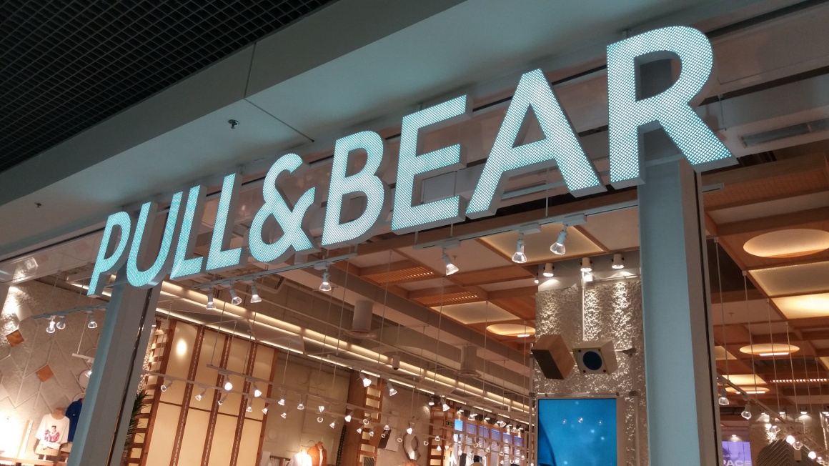
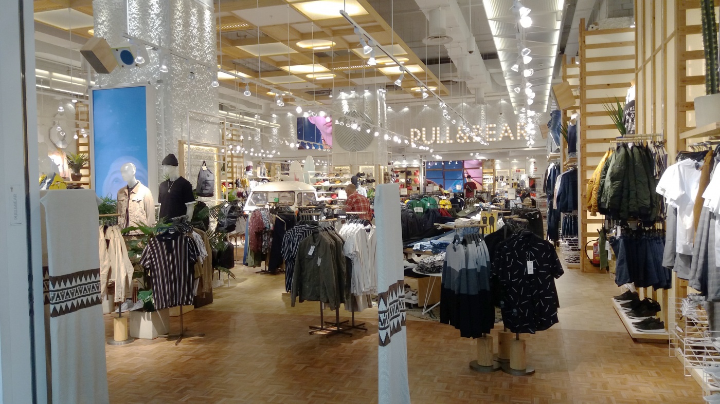
What shop design can look like: Pull & Bear in Ourense, Spain
Sometimes you just need an eye-catcher to lure customers into a store
Mörs/iXtenso
While I was on vacation in Ourense, a city in northwestern Spain, the “Pull & Bear” store in the Ponte Vella Shopping Center caught my attention. A small bright orange VW bus that also works as a shoe rack stands out right in the center of the store. Also aboard are surfboards. And there is a seat on the back of the van.
Very cute: The license plate “P&B 1991“ hints at the year the store was founded – and also cleverly promotes the brand by being featured on perfumes and sweaters.
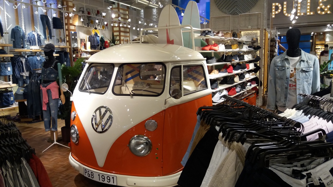
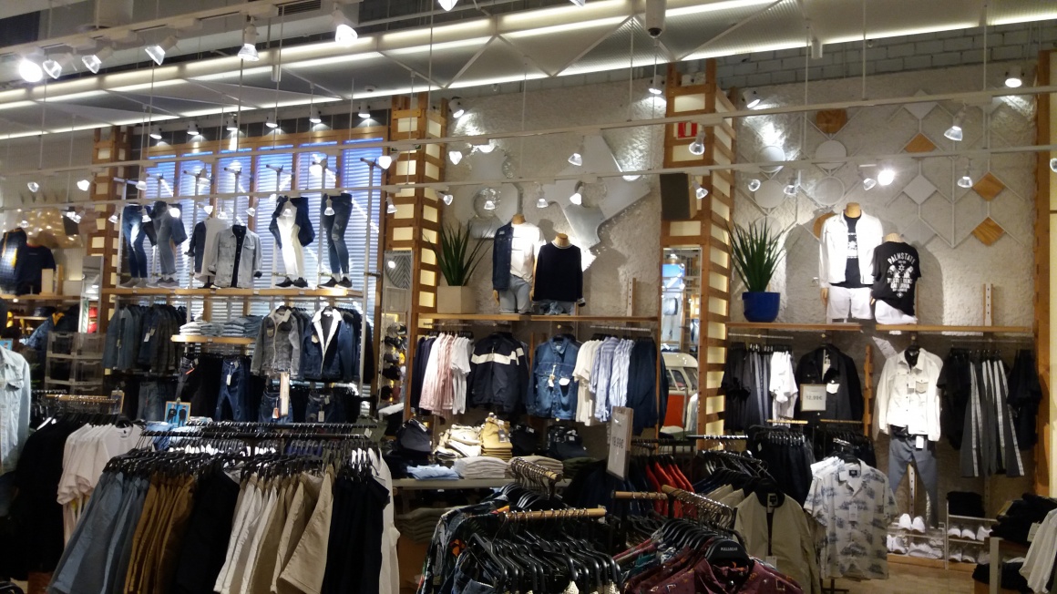
The bus and surfboards designate the fashion segment: casual men’s and women’s wear is showcased in this area. Incidentally, this is how Pull & Bear sets itself apart from Zara, another one of the eight brands of the umbrella company inditex.
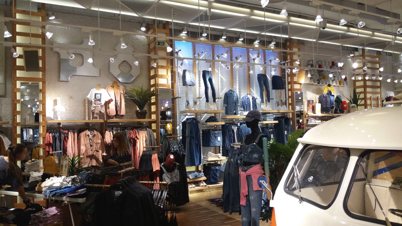
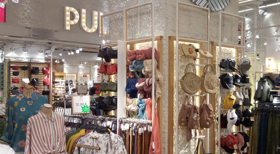
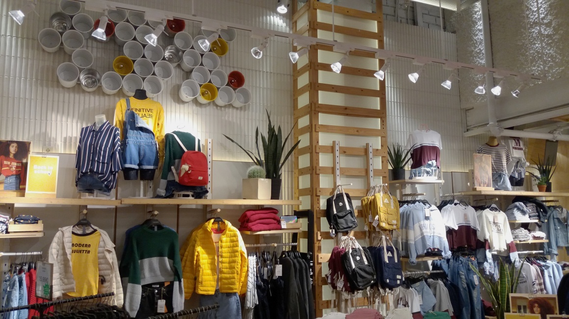
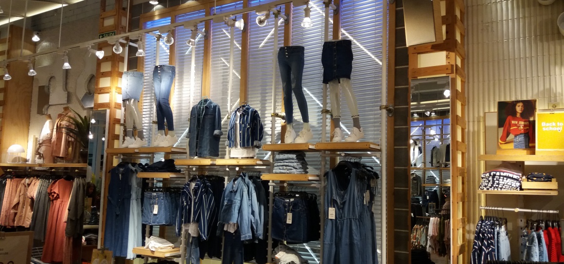
The walls are visually divided into different sections. The concept is actually quite simple: the walls are decorated with repurposed clay pots and other types of clay embellishments. The clothes in these sections are color-coordinated. The mannequin torsos and legs above the merchandise showcase selected pieces of the collection. This makes it easier to find your way around the store.
More Shopdesigns:
- 01.08.2018What shop design can look like: Harrods in London
- 29.01.2018What shop design can look like: The unique store of Mußler Beauty by Notino
- 20.12.2017What shop design can look like: the Steiff flagship store in Munich
- 25.09.2017What shop design can look like: Angermaier Trachten in Munich
- 31.08.2017What shop design can look like: the Lego flagship store in Berlin
Screens are mounted at the entrance and in the center part of the store and in very large format behind the cash registers to offer marketing with a human touch.
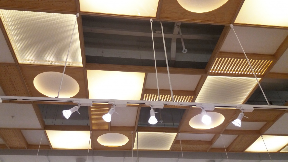
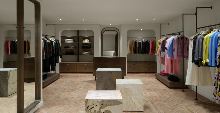
The backlit wooden shelves provide warm, pleasant lighting. Some of the shelves feature frosted glass. Flexible track lighting highlights the clothing items with bright light. Mounted to the ceiling are large-scale, flat lights in different shapes, echoing the wood look wall panels. All of it exudes a harmonious ambience. However, the ceiling becomes somewhat unsettling thanks to the added light sources that are scattered throughout the store.
It’s anybody’s guess why the retail security systems at the exit area are covered with blankets. They might be either broken or just ugly. Though it makes you wonder whether this solution actually makes them look more attractive.